Panel One
Expand Panel One Reflection
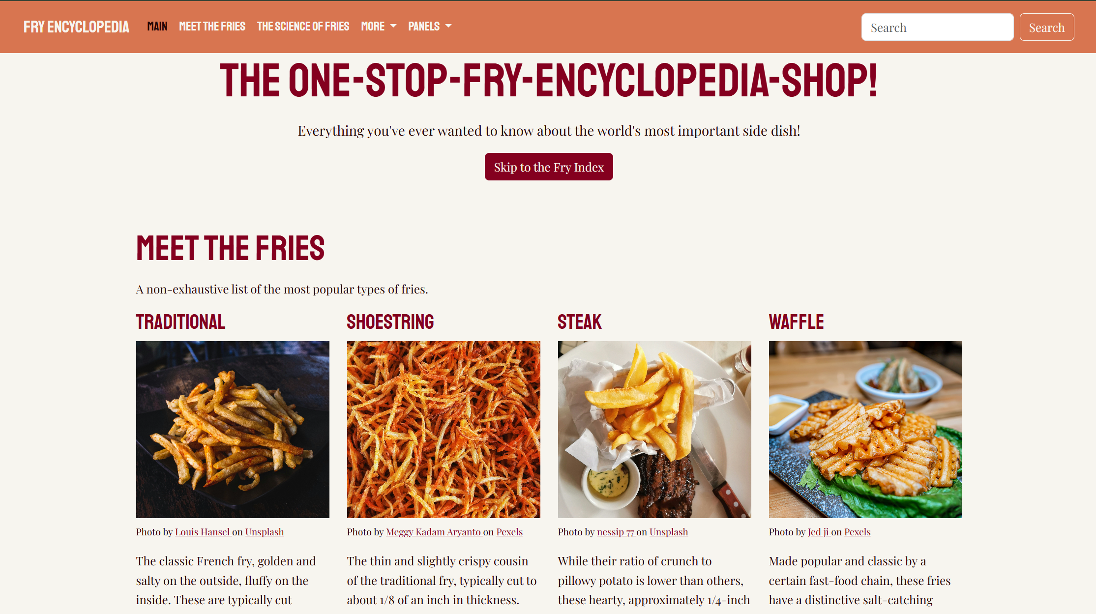
I really enjoyed working through this panel. I'm discovering that the content aspect of these projects is just as thrilling for me as watching them come to life with the code behind them. Hopefully, my passion for French fries shines through! After creating my first website from scratch for Project One, it was exciting to learn how to use Bootstrap to build something more efficiently without sacrificing the aesthetic I wanted. It was certainly much faster, and the possibilities seem just endless! I used Bootstrap components like the navbar, accordion, cards, buttons, and progress bars, and then customized the colors, fonts, and other details to make the site exactly how I wanted it. I especially enjoyed building the Fry Index. I had a vision of an "index your own fries" tool, something similar to an online quiz, but I realized I had gotten very carried away in the first third of the assignment, so that concept will have to remain in my imagination. I was very serious about rating the fries accurately, though, and yes, the math checks out. One of the biggest things I had to learn was how to work with Bootstrap's existing styles while adding my own CSS without things conflicting. I also had to pay attention to making the site responsive so that it would look good on different screen sizes. Overall, I am proud of how much more comfortable I am becoming with HTML and CSS, and I enjoyed being able to focus on the design and content while learning how to use a framework!
Panel Two
Expand Panel Two Reflection
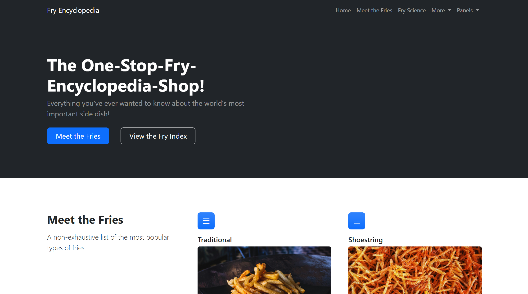
This panel was a different kind of challenge because I had to work with an existing theme instead of completely customizing the design myself. I was used to having the freedom to change whatever I wanted in my CSS, so it was interesting to focus on editing the HTML content and making the theme Initially, I felt very boxed in by the confines of the theme I had selected, but I worked with what I had and got through it by noting where I would be able to make major changes to return to the vibe I worked so hard for in Panel One. I had to learn how to use the classes and components that were already available instead of trying to build everything from scratch. I also realized that working with an existing template can save a lot of time, but it means making design decisions within the limits of what is already there. I enjoyed seeing how much I could accomplish just by changing the content and using the structure that had already been built for me. This panel forced me to exercise some creative restraint, but it did still take some creativity to adapt my information and structure from Panel One into the template. Sometimes the best option relies on knowing how to work with the tools and resources you have, so this panel allowed me to practice that.
Panel Three
Expand Panel Three Reflection
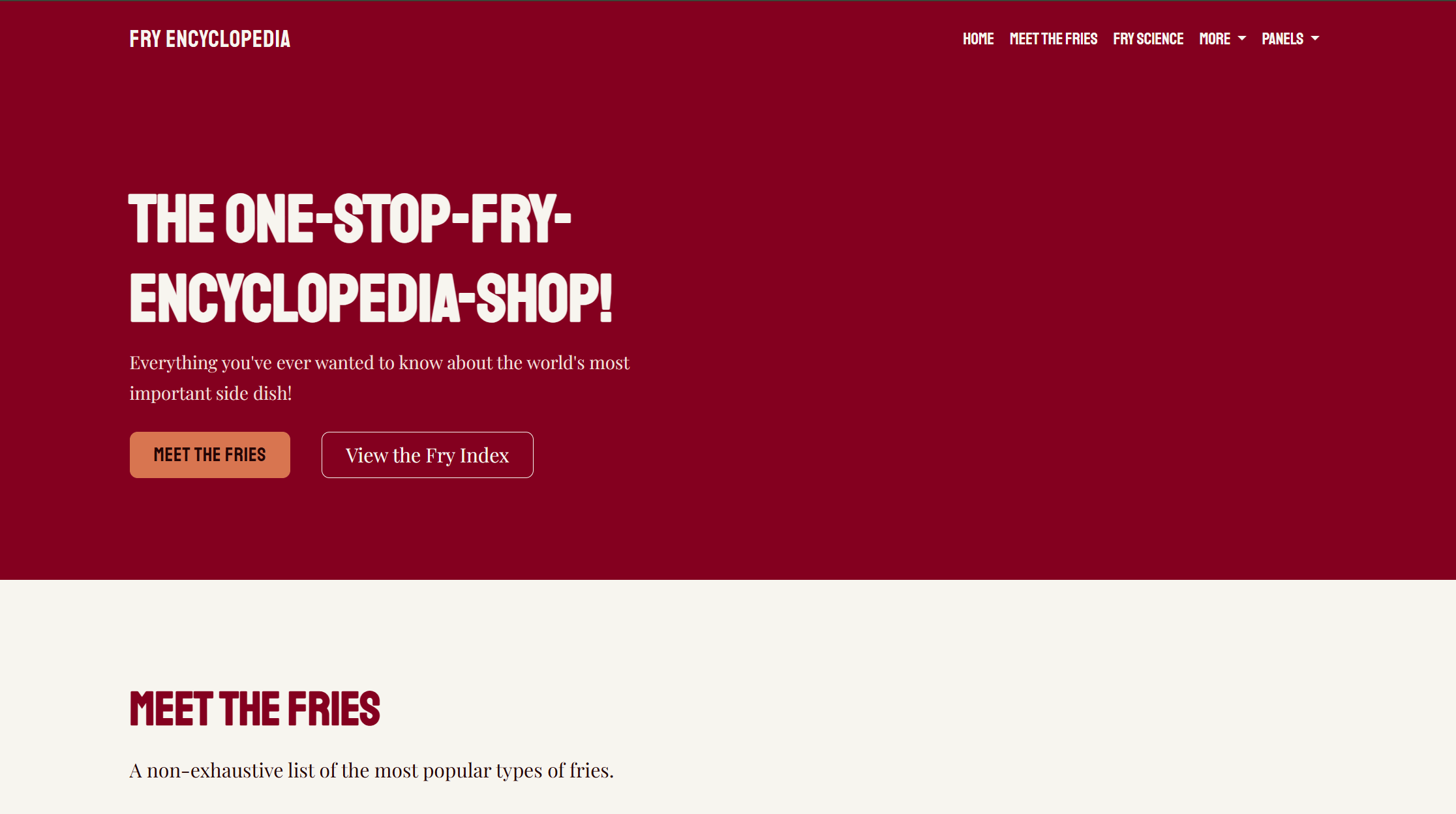
This was probably the most challenging panel because I had to take an existing theme and make it feel much more like my own design. I used custom CSS to change the colors, icons, typography, spacing, and layout throughout the site, while still keeping the Bootstrap structure and components. I wanted this panel to look noticeably different from Panel Two, and it was so exciting to see how different it ended up even though both started with the same general theme. The bones of the theme are definitely still poking through. A big learning experience for me was figuring out how different CSS rules interact with each other. Sometimes I would make a change expecting it to affect one part of the page, only to find that another rule was overriding it or that the layout behaved differently at another screen size. Getting the fry grid to arrange itself the way I wanted across desktop, tablet, and mobile was especially important. Apparently, seven items is a magic number for being impressively difficult to lay out. My pictures insisted on jumping around and being exactly where I did not want them to be. Eventually, though, I got all my ducks (or should I say fries) in a row! This project helped me understand why organization, specificity, and responsive design matter so much. I still have plenty to learn, but I feel much more confident experimenting with CSS and troubleshooting problems than I did when I started Project One! I am very proud of how deeply I got to dive into the Bootstrap world and that I was able to take a pre-existing design and customize it into something so personal.